
Illuminating GDP
"GDP figures are 'man-made' and therefore unreliable," reported remarks of Li Keqiang (then Communist Party secretary of the northeastern Chinese province of Liaoning), March 12, 2007.
Satellites are great. It is hard to imagine living without them. GPS navigation is just the tip of the iceberg. Taking advantage of the immense amounts of information collected over decades, scientists have been using satellite imagery to study a broad array of questions, ranging from agricultural land use to the impact of climate change to the geographic constraints on cities (see here for a recent survey).
One of the most well-known economic applications of satellite imagery is to use night-time illumination to enhance the accuracy of various reported measures of economic activity. For example, national statisticians in countries with poor information collection systems can employ information from satellites to improve the quality of their nationwide economic data (see here). Even where governments have relatively high-quality statistics at a national level, it remains difficult and costly to determine local or regional levels of activity. For example, while production may occur in one jurisdiction, the income generated may be reported in another. At a sufficiently high resolution, satellite tracking of night-time light emissions can help address this question (see here).
But satellite imagery is not just an additional source of information on economic activity, it is also a neutral one that is less prone to manipulation than standard accounting data. This makes it is possible to use information on night-time light to monitor the accuracy of official statistics. And, as we suggest later, the willingness of observers to apply a “satellite correction” could nudge countries to improve their own data reporting systems in line with recognized international standards.
As Luis Martínez inquires in his recent paper, should we trust autocrats’ estimates of GDP? Even in relatively democratic countries, there are prominent examples of statistical manipulation (recall the cases of Greek sovereign debt in 2009 and Argentine inflation in 2014). In the absence of democratic checks on the authorities, Martínez finds even greater tendencies to distort the numbers.
But before getting to the specifics, it is instructive to take a look at the following two images of the Korean peninsula, the left panel in 1992 and the right panel in 2008 (both reproduced from Henderson, Storeygard and Weil, hereafter HSW). The most obvious feature of this picture is that, as U.S. Secretary of Defense Donald Rumsfeld once said, “North Korea is dark." The more subtle point regards the change in light emissions in these two countries. Over the 16-year period between the two images, South Korea’s light emissions increased over 70 percent, while the economy more than doubled in size. By contrast, in North Korea, consistent with light emissions falling slightly, there was little or no growth. (Light emissions fell 7.4 percent, while, according to one source, GDP rose 6.8 percent.)
The Korean peninsula at night, 1992 and 2008
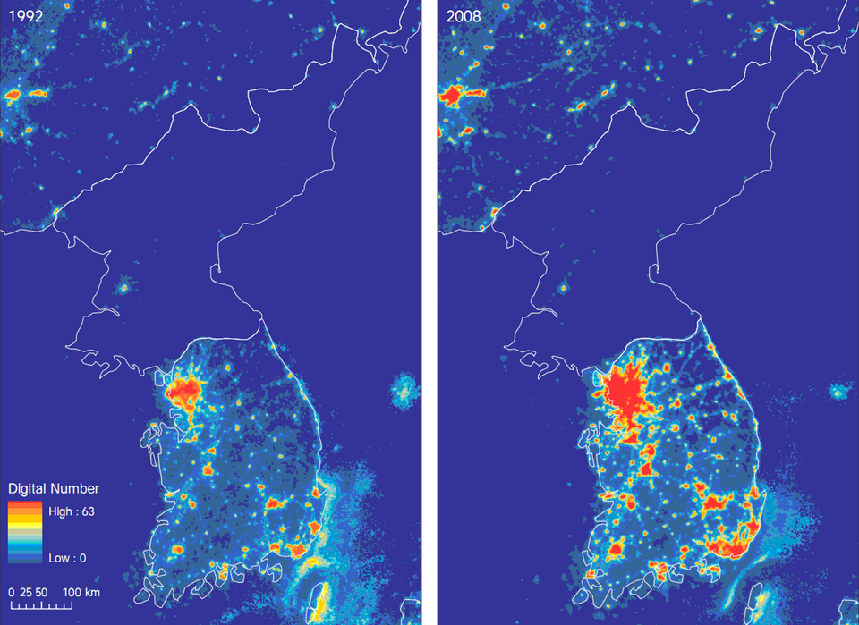
Source: Figure 2, Henderson, Storeygard and Weil.
This brings us to the question at hand: does the nature of a country’s political regime influence the accuracy of its reported statistics? It is easy to think of ways in which corrupt governments can falsify data. First, to make it seem that a country is growing, leaders may simply direct those computing the numbers to inflate them. They may even use draconian methods to enforce such instructions, as was the case when the Soviet government executed the officials responsible for the 1937 census; or when the Greek government tried and convicted—for making statements that undermined the ‘national interest’—the chief statistician (a former IMF official) engaged in 2010 to clean up the country’s data collection and reporting process (see here and here).
But, the problem is a broader one that arises from the incentives to misrepresent wherever statistical independence and proper oversight are lacking. For example, even in the absence of outright punishment, data producers and reporters in autocratic regimes (especially those involved in industrial production) may seek to curry favor with the government by inflating their reports.
To examine the extent of misreporting, Martínez turns to information on night-time light. In theory, governments could simply put up lights to make their country look prosperous, but the example of North Korea suggests that this is not a common practice. Absent such purposeful distortions, we can look to see whether the relationship between night-time light and GDP is the same across political regimes.
To do this, we need three types of data: GDP, night-time illumination, and a quantitative representation of the nature of a country’s political regime. While the first is readily available, the second is extremely difficult to compute. Fortunately, HSW have posted their data here. As for the third, since the 1970s, Freedom House has constructed the annual Freedom World Index (FWI) for a broad cross-section of countries. Using the FWI, Martínez divides countries into three categories: “Free”, “Partially Free” and “Not Free”. He then comes to the following stark conclusion: over the period from 1992 to 2008, night-time light grew on average by five percent per year in all three groups (see Table 1 on page 39). But, comparing the “Free” and the “Not Free”, average annual GDP growth differed by nearly a full percentage point (3.57% versus 4.46%), resulting in a very large 26 percentage-point gap over the full 16-year period.
The following chart makes the same point. Based on the HSW and FWI data, we plot the “not free” countries in red and the “free” countries in black. As the growth rate of illumination increases along the horizontal axis, GDP growth on the vertical axis clearly rises by more in not-free (slope of 0.36) than in free countries (slope of 0.27). Following an exhaustive examination of alternative explanations for this pattern, Martínez concludes that dictators overstate their GDP growth by between 15 and 30 percent per year. That is, if an autocratic country reports annual growth of 10 percent, the actual pace of growth is likely to be between 7.7 percent and 8.7 percent.
Growth in GDP and growth in night-time light for “free” and “not free” countries, 1992 to 2006

Notes: Data are from Panel B of Figure 6 in Henderson, Storeygard and Weil and the Freedom House. The difference between “free” and “not free” countries is based on the average of both the FWI political rights and civil liberties indices over the period 1992 to 2006; countries with an index level of greater than 4 are not free, and those with an index below 2 are free.) The dashed lines are constructed from the regression of GDP growth on the growth of light, and on the product of a dummy variable that takes on a value of 1 for the “not free” countries and the growth of light. The estimates are based on the entire data set, including “partially free” countries that are not shown in the plot. The intercept is restricted to be the same for all data.
The chart also highlights the extent to which China is an outlier (CHN highlighted at the top of the chart). Over the years, there has been a vigorous debate over the accuracy of official Chinese GDP data, with observers arguing that the reported quarterly growth rates are both overstated and too smooth (see the survey here). As the opening quote from current Chinese Premier Li Keqiang makes clear, high-ranking officials also have had concerns.
The data on illumination and political regime are certainly consistent with skepticism about past rates of growth in China. From 1992 to 2006, Chinese night-time light emissions grew at an annual rate of 5.2 percent, while official GDP grew at a 9.4 percent rate. Statistically, however, it is doubtful that a country would be more than two standard deviations away from the dashed black line in the chart above. For a country with China’s increase of illumination, that would suggest a plausible growth rate of up to 7.4 percent, implying an official overstatement of about 25 percent, consistent with Martínez’s analysis for “not free” economies.
Finally, we turn to the broader policy implications of these findings. Is there anything to be done about this misrepresentation? Is there a way to motivate more accurate statistical reporting from autocratic countries? One answer may be in the IMF’s Special Data Dissemination Standards (SDDS). First published in 1996, the SDDS is a voluntary set of guidelines that govern the computational processes, timeliness and availability of official statistics. Since its inception, 75 countries have subscribed, with 17 participating in the enhanced version (SDDS plus) introduced in 2012 (see the map below). The Fund also introduced in 2015 a lower standard for improving transparency—the Enhanced General Data Dissemination System (e-GDDS).
The IMF’s Dissemination Standard Bulletin Board

Source: IMF. The categories are: the 2012 Special Data Dissemination Standard Plus (SDDS Plus), the 1996 Special Data Dissemination Standard (SDDS), and the Enhanced General Data Dissemination System (e-GDDS). NSDP is the National Summary Data Page.
Is the SDDS itself actually causing countries to provide more accurate statistics? Probably not. More likely, those that sign up for the higher standard have chosen to be truthful. But this has significant value. As more countries sign up, it will become increasingly clear which countries are misrepresenting their statistics. In theory, a desire to become a trusted member of the international financial community should drive countries to improve the quality and accuracy of their statistics, and to join the SDDS. It is worth noting that China joined in 2015, and while it has become more difficult to measure activity in China’s increasingly complex economy, there also may be less incentive to overstate the outcome.
How outside observers use data from autocratic countries also could encourage these nations to improve their standards. For those countries that have not signed up for higher standards like the SDDS, applying a routine “satellite correction” to their GDP data would be simple and practical. Those that find this correction disturbing could then avoid it by upgrading their reporting practices.
Acknowledgement: We thank Luis Martínez for his comments and help with the data.