
What's in store for r*?
“Navigating by the stars can sound straightforward. Guiding policy by the stars in practice, however, has been quite challenging of late because our best assessments of the location of the stars have been changing significantly.” Federal Reserve Board Chair Jerome H. Powell, August 24, 2018.
It is amazing how things we once thought impossible, or at least extremely improbable, can become commonplace. Ten-year government bond yields in most of Europe and Japan are at or below zero. And, for U.S. Treasurys, the yield has been below 1 percent since March. That is, the sovereign yield curve in the advanced economies is both extremely low and extremely flat. This means that expected future short-term interest rates—the one-year rates in 2025 or 2030—also are extremely low.
A confluence of factors has come together to deliver these incredibly low interest rates. Most importantly, inflation is far lower and much more stable than it was 30 years ago. Since the mid-1990s, consumer price inflation has been at or below 2 percent in most advanced economies. Second, monetary policy remains extremely accommodative, with policy rates stuck around zero (or below!) for the past decade in Europe and Japan, and only temporarily higher in the United States. Third, the equilibrium (or natural) real interest rate (r*)—the rate consistent in the longer run with stable inflation and full employment—has fallen by roughly 2 percentage points since 2008 and is now only 0.5% or lower.
How long will this go on? What’s in store for r*? Focusing on the United States, market (5-year forward 5-year) inflation expectations are running around 1.8% and professional forecasters' long-run expectations are 2.1%. Few observers expect policy rates to rise in coming years. Even in the longer run, most FOMC members doubt that rates will exceed 2.5%.
This all points to a persistently low r*. In this post, we discuss the large post-2007 decline in r* that followed a gradual downward trend in prior decades. After considering various possible explanations, we focus on the relatively sudden change in U.S. saving behavior. Around 2008, there was an abrupt increase in household savings relative to wealth and income. Combined with increased foreign demand for U.S. assets, this appears to be a key culprit behind the recent fall in r*. We doubt that this will change anytime soon.
The following chart plots r* over the past 60 years. The decadal averages, shown as the black dashed lines in the chart, drop steadily from 5% in the 1960s to 2.6% in the 1990s to 0.7% in the 2010s. The most recent decline around 2008 is both the largest and the most sudden. (Estimates for the euro area follow a similar pattern.)
Equilibrium real interest rate (r*), 1961Q1- 2020Q2

Source: Laubach and Williams real time estimates from the Federal Reserve Bank of New York.
To understand this pattern, as well as what the future might bring, consider the likely determinants of the equilibrium rate. We can divide these into two categories: supply and demand. The first set includes the pace of innovation and of gains in total factor productivity; demographics and growth in hours worked; skills, education and the quality of the workforce; and regulation that influences firm creation and business dynamism more generally. These structural factors could slow economic growth, reducing the marginal product of capital and the returns to investment.
On the demand side, there are a number of factors that raise the quantity of available savings in the economy relative to investment opportunities. These include the amount of debt, both public and private; the price of investment relative to consumption goods; income and wealth inequality; and changes in the desire of U.S. households to build a stock of savings as a precaution against adverse events. In addition, there are global factors. Specifically, fast-growing emerging economies may have an excess of saving relative to desired investment that they use to acquire U.S. assets.
The table below provides some information on a number of these determinants of r*. While it is true that productivity growth fell slightly, hours growth did not, and labor quality grew faster in the 2010s than in the 1970s. Both private and public debt levels rose substantially over this entire period, but (except during the 2007-09 crisis) they did it rather smoothly. In addition, wealth inequality increased gradually, although maybe not as much as these numbers suggest (see our earlier post). And, the relative price of investment goods has been falling steadily for decades.
Factors influencing r* (decadal averages), 1990-2019
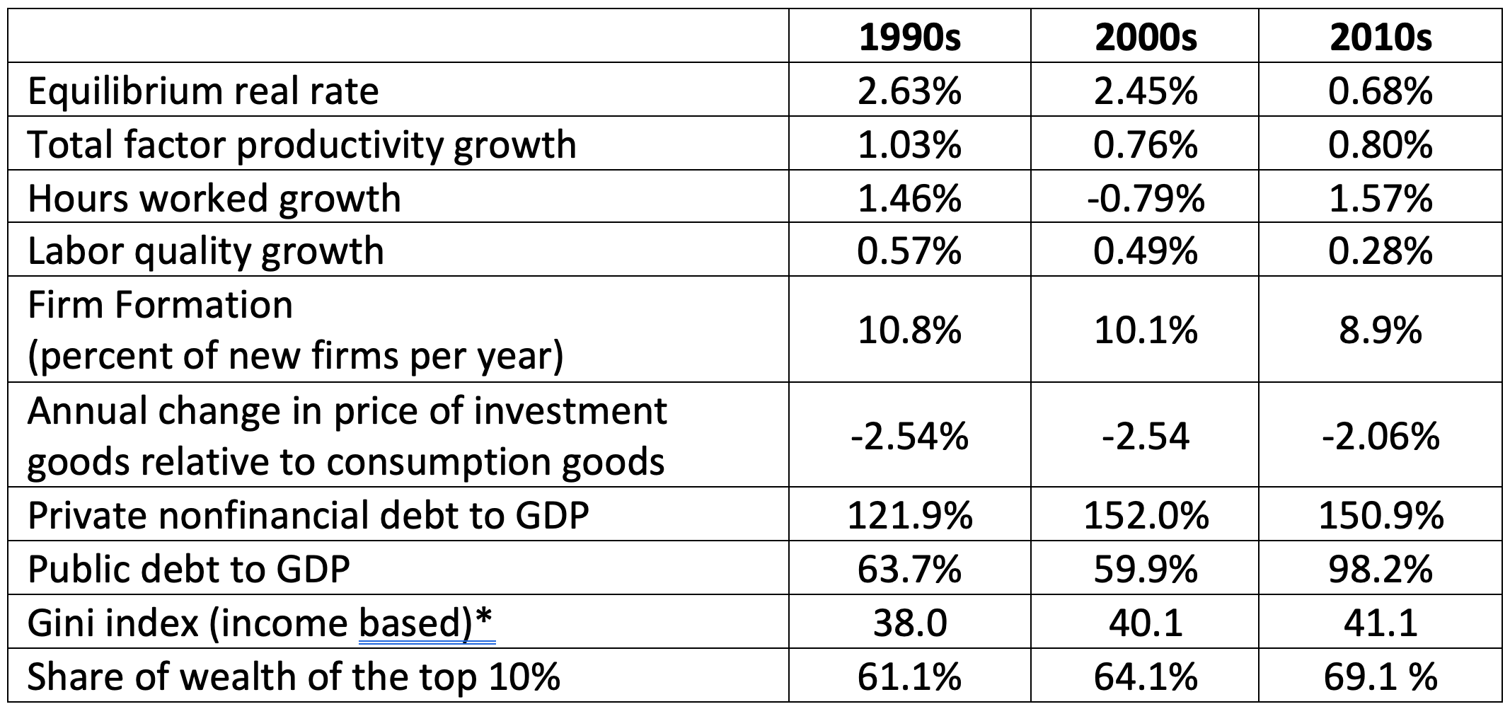
*Gini coefficient is for 1990, 2000, and 2016. All other data are averages for decades.
Sources: Equilibrium real rate is from the Federal Reserve Bank of New York; total factor productivity, growth in hours worked, and labor force quality are cyclically adjusted from the Federal Reserve Bank of San Francisco; rate of firm formation is from the Bureau of the Census, Business Dynamics Survey; private nonfinancial and public debt to GDP are from the Bank for International Settlements; the Gini index is from the World Bank; and the share of wealth of the top 10% is from the Federal Reserve Board.
Looking at the overall pattern, we can see trends that might be responsible for the steady decline in the equilibrium real interest rate from 1960 to the mid-2000s. However, it is harder to explain the precipitous drop around the time of the 2007-2009 financial crisis. The reason is that all these measures evolved rather smoothly. Needless to say, a series that moves smoothly is not going to be very helpful in explaining one that jumps.
Instead, we look to savings—first foreign and then domestic—for an explanation.
As Ben Bernanke first noted more than 15 years ago, in a number of fast-growing emerging market countries, domestic saving has outstripped desired investment. Much of the excess has been shipped into the United States. As the following chart shows, over the past 30 years, we have seen a large change in the U.S. net international investment position. At the end of the 1980s the United States went from being a net creditor to being a net debtor. From 1990 to 2007, capital inflows drove the net position to –9 percent of U.S. GDP. Then, the pace of capital inflows picked up. Over the most recent decade, the net international investment position increased to –51 percent of GDP—an increase of 42 percent of GDP.
U.S. net international investment position (Percent of GDP), 1976-2019

Source: FRED.
After 2007, there also was an abrupt shift in U.S. household saving behavior. To see it, consider the following figure. The solid black line is the personal saving rate, measured as a percent of personal disposable income (S/Y). The first part of the picture is familiar to anyone who kept track of such things prior through the early part of this century. The saving rate trended down until it bottomed at 2.5% in mid-2005. Turning to the red line, here we plot the ratio of wealth to personal consumption expenditure (W/C). Again, focusing on the 1960 to 2007 period, note that the numbers rise from around 5.5 in the latter half of the 1970s to nearly 7.5 in early 2007—just prior to the Great Financial Crisis (GFC). As it turns out, over the 1960 to 2007 period, the black and red lines have a very strong correlation of –0.67. That is, U.S. households behaved as if they had a target wealth-to-consumption ratio, so their savings rate declined when wealth rose (and vice versa). (Leaving housing wealth and consumption out has only a very modest impact on this conclusion.)
Personal saving rate (percent) and ratio of household net wealth to consumption, 1960-2019

Source: FRED and authors’ calculations.
Looking at the period after 2007 in the chart, we can see that things change markedly. Suddenly, the two series start rising together. People’s saving rate increased even as the ratio of wealth to consumption climbed toward new highs. To see how anomalous this behavior is when seen through the lens of the earlier pattern, the dashed line shows the post-2007 fitted values of a simple regression (estimated through 2007) of the saving rate on the wealth-consumption ratio (and on r*). That is, extrapolating the historical pattern, we would have expected to see the saving rate plunge below zero! Instead, from 2008 to 2019 it averaged 7%.
To see what this means—how big the sudden increase in domestic savings is—note that the area between the solid line and the dashed line over the 2008 to 2019 period sums to 74 percent of one-year’s disposable income, or 56% of GDP. This is somewhat larger in magnitude than the 42-percentage point decline in the net international investment position (shown in red in the prior chart).
From this, we conjecture that r* is exceptionally low because of a combination of stubbornly high domestic U.S. saving and considerable foreign investment inflows. Following the Great Financial Crisis, households wanted a bigger rainy-day fund, while the rest of the world wanted more safe assets. Are either of these drivers likely to change soon? We doubt it. As divided as its people and policymakers may be, the U.S. federal government remains the key supplier of liquid, safe assets to the world.
If anything, the pandemic will reinforce these trends, encouraging U.S. households to sustain outsized precautionary saving and drawing foreigners to invest in what remain relatively safe U.S. assets. Even as it settles back from the transfer-induced April spike, the September 2020 personal saving rate remains nearly double the 2019 average. And, over the first half of 2020, net international investment in the United States rose at an annual rate of nearly 40%—more than double the average for the prior decade. A high saving rate, combined with continued capital inflows, could weigh on r* for years to come. (Gourinchas and Rey conclude that this increase in precautionary savings is a global phenomenon.)
Why should we care so much about r*? There are two big reasons. The first concerns monetary policy. As Chair Powell implies in the opening quote, uncertainty about r* makes it difficult to calibrate central bank actions (see our earlier post). Is current policy adequate to support the economy? To answer the question, we need to know where interest rates are supposed to be in equilibrium when inflation is at the Fed’s target and employment is at its sustainable maximum.
Second, there is fiscal policy. The pandemic has driven government debt to wartime levels. At high levels, the debt path is sustainable only with a combination of low interest rates, high growth rates, and sufficiently large primary budget surpluses. The likelihood of persistently low r* makes this easier.
Yet, it is important not to become complacent. High-debt countries with stable debt-to-GDP ratios are on a knife-edge: all other things unchanged, if r* rises, their debt paths become unsustainable. And, the circumstances that are keeping r* low could change. Domestic U.S. savers eventually could revert to their old ways, foreigners could find they have sufficient U.S. assets to meet their needs, or both. The result could be a sudden rise in the risk premia on “safe” U.S. assets.
How would this matter? In its latest long-term budget outlook, the CBO anticipates that Treasury debt held by the public will climb from 98% of GDP in 2020 to 142% in 2040 and 195% in 2050. It’s not difficult to imagine that—at some stage—investors will seek greater compensation for holding this debt. Imagine that U.S. government debt is at 120% of GDP and that r* reverts to its pre-2008 level, rising by two percentage points. Assuming the pace of growth is unchanged, fiscal policy would have to tighten by 2.4 percentage points of GDP—that’s the change in r* times the debt-to-GDP ratio—just to keep the debt-GDP ratio from deteriorating (see here). Needless to say, the long-run fiscal “adjustment” would be especially painful if a future rise in r* compels a rapid cut in government expenditure, a sudden increase in taxes, or both.