
Warsh's Communications Dilemma: Talk Less, or Say More?
“Unlike many of my colleagues past and present, I don’t believe in forward guidance. I don’t believe that I should be previewing for you what a future decision will be.” Kevin Warsh, Senate Banking Committee Confirmation Hearing, April 21, 2026.
Chair Kevin Warsh arrived at the Federal Reserve last month with an agenda for change in the central bank’s communications. Talk less. Replace granular forward guidance with a durable policy framework. And, according to news reports, scale back or even scrap the dot plot – the policy-rate projections in the quarterly Summary of Economic Projections (SEP), which also collects FOMC participants’ forecasts for inflation, unemployment, and growth.
Before assessing any reform proposal, it is important to be clear that the purpose of monetary policy communication is to convey the FOMC’s reaction function — the relationship between economic conditions and the path of the policy rate. If the public and financial market participants understand policymakers’ reaction function, they can anticipate how new information will influence future policy: that is, what an unexpected rise in inflation, a deterioration in labor market conditions, or a shortfall in economic growth each implies for policy. That anticipation is itself stabilizing. When something unexpected happens – when a shock hits the economy — financial conditions will adjust quickly, in advance of the Fed’s response.
Communication of the reaction function is not just window dressing. Done well, it makes policy more effective. This is the standard against which we should measure any reform of Fed communications.
Chair Warsh’s diagnosis of the Fed’s shortcomings raises a question: if the Fed needs a new, clear policy framework, how does a prescription for saying less make sense? In our view, transparency and communication are not the same thing. Transparency is how much the Fed discloses; communication is whether what it discloses conveys an understanding of its reaction function. The two can move in opposite directions — if the extra material is noise, a central bank can disclose more yet communicate less. In that sense, Warsh is right that more talk is not the goal in itself.
But the best remedy for an imperfect policy framework is clearer communication of the actual reaction function. That requires disclosing more of what matters and less of what does not, allowing Congress and the public to hold the Fed accountable for its legal mandate.
What Chair Warsh Says He Wants
The Chair’s thoughts on communications reform have two distinct components that rest on different arguments. Let’s consider them in turn.
The first focuses on process: reduce the frequency of public speeches, stop the practice of individual FOMC participants telegraphing their policy inclinations between meetings, and, as the opening citation hints, reduce forward guidance (which is one way of characterizing the dot plot). Warsh argues that the proliferation of Fed voices increases noise rather than clarifying the signal. The resulting policy cacophony is more likely to fuel market volatility than it is to enhance stability.
The second component is more fundamental: Chair Warsh argues that the Fed’s credibility has suffered from misplaced confidence in its faulty inflation models, along with a “flexible average inflation targeting” framework (adopted in 2020) that failed to provide adequate discipline when inflation surged in 2021. Inflation at 40-year highs in 2022 undermined trust in the Fed.
Rather than blame the Fed for communicating its reaction function poorly, the charge appears to be that the central bank suffers from “false precision and analytic complacency” in its approach to near-term forecasting (for a broader institutional critique, see his April 2025 G30 Commanding Heights lecture). He also notes that policymakers sometimes act as if their forecasts are commitments, delaying necessary policy adjustments. One might say that the reaction function itself has become incoherent.
These two arguments pull in different directions. The first says: cut the noise — the signal is good, but too many voices drown it out. The second says: you cannot reliably signal what is incoherent. Without a framework, you cannot communicate your way to credibility.
Even if both arguments are correct, we think that Warsh’s solution to say less has it backwards. Observers find the FOMC reaction function hard to read because the Fed publishes too little about it, not too much. And, if the FOMC is acting incoherently, exposing its confused reaction function is critical to make the Fed accountable. From a practical point of view, we also share former Chair Powell’s assessment of the dot plot: “you can’t beat something with nothing” (see Powell’s final press conference).
In this post, we discuss three proposals for how the Fed could do better. Our own would enrich the dot plot, linking each participant's rate path to the forecasts behind it. Former Chair Bernanke would add a single staff-owned baseline forecast paired with explicit scenarios. Bordo, Levin, and Levy would have the Committee publish illustrative policy responses under a set of alternative scenarios. While these proposals differ in method, each reveals more about the reaction function, not less. A thoughtful integration of these proposals could probably do better than any one of them. We take them in turn.
The Cecchetti-Schoenholtz Approach: A Richer Dot Plot
Seven years ago, in our analysis of FOMC communications, we called for making the dot plot more informative, not eliminating it.
The core problem with the current SEP is that it publishes too little of what matters. The dot plot shows where each FOMC participant expects the policy rate to be at year-end over the next three years — but it is devoid of the economic context. A participant who expects a higher rate might foresee stronger growth or higher inflation, hold a different view of the neutral rate, or simply respond more forcefully to the same outlook. Which is it? As currently constructed, the dot plot reveals an FOMC participant’s conclusions but not their analysis. Put differently, it shows the output of the reaction function without showing the inputs.
Our solution is to enrich the SEP. Specifically, we proposed publishing a matrix that would link each FOMC participant’s economic forecasts for inflation, unemployment, and growth directly to their interest rate projection. This linkage would allow informed observers to see not just where each participant expects the rate to go, but why. It would, in effect, make each participant's reaction function visible. Crucially, the FOMC already collects this information; it just withholds publication for five years. We saw (and still see) no good reason for that lag.
We also argued for going one step further: identify which dot belongs to which FOMC participant. (The FOMC currently does this in detailed meeting transcripts that appear with a 10-year lag!) Anonymous projections are a peculiar form of accountability. When a participant’s forecast proves systematically wrong, or their rate path is inconsistent with their own economic outlook, the public and Congress have no way to know. Naming the dots might not sharpen the projections themselves, but it would at least enhance the quality of the public debate around them.
A named matrix still leaves a second job undone. The matrix traces the reaction function locally — how each participant adjusts the rate path to small movements in inflation, unemployment, and growth around the current outlook. This is exactly the information needed in normal times. But it says little about FOMC behavior in the tails, where the reaction function may be nonlinear: say, at the effective lower bound, when inflation expectations threaten to come unanchored, or when financial stress feeds back into the real economy. Scenario analysis is the tool for that second job. In our 2019 paper, we urged the Committee to supplement the SEP by publishing the distribution of participants’ responses to scenarios that deviate substantially from the current outlook — focused on, but not limited to, prominent tail risks. These two devices are complements: the matrix calibrates the local reaction function, and scenarios trace its nonlinearities when conditions are far from normal.
Warsh’s instinct seems to run in the opposite direction. Where we would give everyone more information about the reaction function — by publishing the matrix and identifying the participants — he would downplay and possibly even drop the dot plot. In theory, a cleaner framework could eventually make extensive SEP transparency unnecessary. But that strikes us as hopeful for a central bank like the Fed, which pursues a dual mandate through a 19-member committee whose participants can weigh the two goals differently — especially when those goals come into conflict. It certainly would not remove the need for effective public oversight.
Bernanke’s Answer: More Systematic Transparency
Former Fed Chair Ben Bernanke offers a different prescription. As the centerpiece of a new quarterly Economic Review, he proposes a single, internally consistent forecast — led and “owned” by the Board staff — paired with staff scenarios that trace how policy might respond as the economy departs from the baseline. Rather than abolish the SEP’s 19 individual projections, Bernanke would keep them — at least initially — while making them more informative and complementary to the staff materials. His approach adds the discipline of an internally consistent baseline while addressing what he sees as the SEP’s core defect: the conflation of individual projections with collective guidance.
Our approach and Bernanke’s share a common motivation. We would build on the individual projections, enriching them so observers can see the economic logic behind each rate path; Bernanke would make an internally consistent staff forecast the centerpiece, with the projections retained alongside it. Either way, the Fed would reveal more, not less, about its reasoning.
Bernanke’s framework blends transparency and discipline. The staff baseline is internally consistent, and the scenarios let the FOMC offer more explicit contingent guidance, signaling that policy is not on a preset course. The conditionality is real, but it is the staff’s: it shows how the staff reads the reaction function, not how each policymaker would act.
Why do we put the individual projections, rather than a staff forecast, at the center? Because the staff forecast is not the forecast of the FOMC participants. If it misses systematically, no individual policymaker (except possibly the Chair who oversees the staff) owns the error, so whom should Congress and the public hold to account?
Bordo, Levin, and Levy: Scenarios through the FOMC Process
Bordo, Levin, and Levy not only address the character of the scenarios, but also who should develop them. They would have the FOMC formulate a set of scenarios through the same process it currently uses for generating the SEP. The scenarios themselves would remain illustrative, not binding commitments. Nevertheless, from our perspective, following the usual FOMC process provides Committee accountability that a staff-led exercise cannot supply.
If the Fed’s framework is genuinely confused, then “Committee-owned” scenarios are how it can show Congress and the public where it stands — and let them hold it accountable. Bordo, Levin, and Levy would have the Fed say, in effect: “Here are the conditions under which we would tighten, and here are the conditions under which we would ease. We will update these scenarios as our framework develops.”
The Central Tension
Ultimately, the deepest problem with Chair Warsh’s communications agenda is that his reform proposals do not help to illuminate the reaction function.
In our view, any case for sidelining or abolishing the dot plot rests on the premise that a cleaner nominal anchor will eventually make detailed quarterly projections unnecessary. That logic conflates two different things: the framework the FOMC articulates and the actual reaction function that its policy actions reveal: that is, how the Committee behaves in practice when it is surprised, regardless of any formal commitment it may have made.
These can diverge substantially. The Fed’s post-pandemic experience provides a clear illustration. Like Warsh, we think the FOMC had a faulty framework in 2021, but it nevertheless had one. The “flexible average inflation targeting” scheme adopted in August 2020 called for allowing inflation to run modestly above 2 percent to offset prior undershooting. What the SEP projections from that period reveal are both forecasting and reaction function failures even in the presence of that framework.
For example, as annual core PCE inflation rose from 1.4 percent in December 2020 to 3.5 percent by mid-2021 and continued climbing, the FOMC’s median projection, meeting after meeting, gradually tracked along with a lag. Not only were the 2021 projections persistently slow to adjust, but they did not lead to a policy tightening until March 2022, when core inflation was setting 40-year highs. No one considered that to be a modest overshoot. The 2022 and 2023 projections then made the opposite error, overshooting realized inflation as the FOMC belatedly caught up — a reaction function that first lagged the climb and then overcorrected. The following chart, contrasting the SEP's end-year core inflation projections with what actually happened, captures these serially correlated forecasting errors.
FOMC SEP Projections for End-year Core PCE (ex-food and energy) inflation vs. Realized (Quarterly, 2020-23)
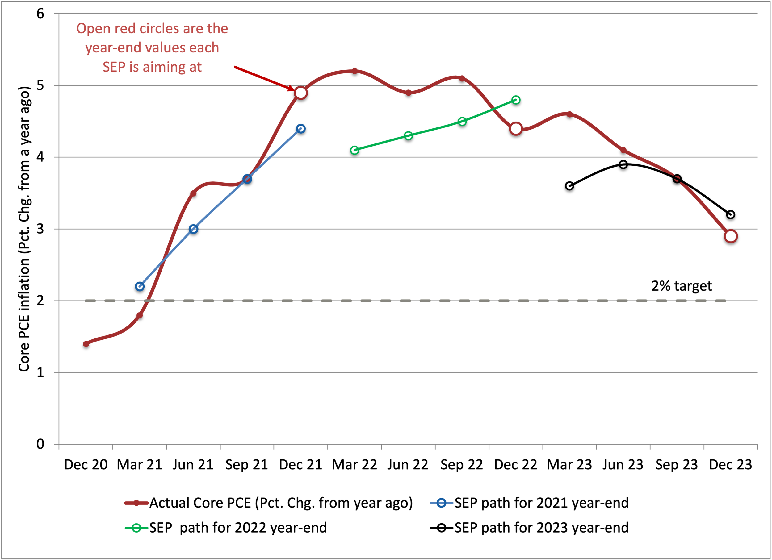
Notes: The figure shows median FOMC projections made quarterly for year-end core PCE inflation (percent change of fourth-quarter prices from a year ago) as well as realized core PCE inflation. Each projection series begins at the first FOMC meeting of the respective target year. Red hollow circles mark the fourth-quarter (December) realized core PCE inflation for each year. Sources: Federal Reserve (various SEP issues) and Bureau of Economic Analysis (realized core PCE inflation).
This forecasting fiasco also is consistent with a disturbing asymmetry in the FOMC’s reaction function. When the COVID shock hit, driving employment sharply downward, policymakers responded with extraordinary speed and force. However, their failure to anticipate the 2021 inflation surge, combined with overconfidence in their inflation models, led to a long policy delay. Put differently, the Committee’s de facto reaction function revealed much more tolerance for rising inflation than for comparable shortfalls in employment — an asymmetry that is inconsistent with an equal treatment of the Fed’s dual goals. Such critical information about the reaction function is exactly what a richer SEP, one linking each participant’s economic forecasts to their rate path projection, could have made explicit in real time, instead of leaving markets and Congress to infer it after the fact.
Rather than helping us to understand the reaction function, abolishing the dot plot would remove one of the few structured sources of evidence we have. Unless and until a new policy framework renders the SEP obsolete, observers will try to read the reaction function from whatever signals they can find. A quieter Fed that gives them less to work with would tend to increase uncertainty, rather than contribute to economic growth and stability.
Our View
We share Chair Warsh’s goal of enhancing Fed accountability. For this purpose, the public needs more information about the FOMC reaction function, not less. We favor transforming the dot plot, not abolishing it — and complementing it with scenario analysis. While we would not make the staff economic forecast the centerpiece of an FOMC report, adding it to the SEP would still be helpful. Abolishing the dot plot before agreeing on a new framework would reduce accountability, increase uncertainty, and risk harming the economy.