
What Should the Fed Measure?
"Among the projects that the economics profession, and … the Fed needs to do, is to try to use our new understanding and new data sources to see what’s really the inflation rate in the economy." Federal Reserve Chair Kevin Warsh, Senate Banking Committee confirmation hearing, 22 April 2026.
Every day, Harvard Business School researchers collect the posted prices of roughly 350,000 items sold by five large U.S. retailers and sort them by country of origin. Their tariff tracker showed what the 2025 tariffs did to prices U.S. residents actually pay. It also showed something no official series reports: how the increases split between foreign- and U.S.-made goods. Even within a few days, the increases were not confined to imported goods — weeks before the official series would show anything at all.
Researchers are now exploiting “big data” – broader samples observed at high frequency – to improve inflation measurement. For example, PriceStats tracks more than 500,000 U.S. prices daily compared to the 90,000 prices that the Bureau of Labor Statistics (BLS) field staff collect monthly. The NBER’s Economic Measurement Research Institute is exploring how to use item-level transactions data to value quality changes in retail goods, a source of changing bias in price measurement (see, for example, Cafarella et al.). And the research keeps coming: Cavallo, Lippi, and Miyahara show that the frequency with which firms change prices rises sharply after a large shock, so big shocks pass through to consumer prices faster than standard models assume.
Given all the new data and the rapidly growing body of related research, the Fed's Data Task Force, charged with improving the quality and timeliness of real economic signals, will find no shortage of material.
The question is what all of these data can actually do for the Fed. The answer depends on what the FOMC needs.
What the FOMC needs to know
Congress instructs the Federal Reserve to pursue maximum employment and stable prices (see here). In this post we examine what data the Fed requires to pursue the price-stability portion of the mandate. To set policy, the FOMC needs two things. First, an estimate of the inflation trend — the persistent pace after temporary fluctuations fade. Second, the means to identify the source of any deviation from that trend. The right policy response depends on whether the deviation springs from movements in demand or supply, and the two call for opposite responses.
Estimating the trend
What does the FOMC need to improve its estimate of the inflation trend?
In our recent post we discussed the challenge of decomposing measured inflation into a slow-moving trend and a great deal of transitory relative-price movement. The latter is real but mean-reverting — like a frost-induced spike in orange prices. From the perspective of the FOMC, this is noise. To recover the trend — the signal — policymakers apply filters that strip out the noise.
This picture requires two refinements. First, there are two types of noise around the trend: the transitory relative-price movements just described, and ordinary sampling error in the price data itself. New data address only the latter. Second, the bias in the index moves fastest exactly when relative prices do — contaminating the observed pace of change rather than just the average price level.
To see what these refinements imply, consider a decline in measured inflation. It may signal several things: a fall in the trend, the reversal of a transitory shock, a change in the index’s bias, or a more positive skew that makes a trimmed filter read artificially low. Only the first justifies policy action.
Which parts of that problem could better data improve? There are three candidates: read the trend faster, as the tariff tracker appeared to do; measure individual prices more precisely; pin down the bias in the price measure (whatever its source — substitution, quality, or the arrival of new goods). Take them in turn.
Start with speed. High-frequency data arrive without the official series' publication lag, so the Committee can see each reading weeks sooner. That is worth having — but not for estimating the trend. The transitory swings that filters like trimming remove play out over months, regardless of the sampling frequency; more frequent measurement may show the noise in finer detail, but it won't help remove it any faster.
Now precision. Sampling error and transitory movements are generally uncorrelated: how carefully we record the price of oranges has nothing to do with when a frost hits. So better measurement cannot help the Committee tell one from the other. It can only shrink the sampling component. So how big is that component?
The BLS publishes estimates at several intervals. For the 12-month change in the all-items CPI, the sampling error variance is roughly 0.012 in units of percentage points squared. Since 1995, the variance of the gap between a 12-month average of the Cleveland Fed's trimmed-mean CPI and the 36-month centered trend in headline CPI is 0.61. Sampling error thus accounts for roughly 2 percent of the variation around the trend. Eliminating it entirely would leave any estimate of the trend virtually unchanged.
In sum, better price measurement buys almost nothing on the dimension that matters. The noise obscuring the trend mostly comes from genuine, transitory movements in relative prices.
Finally, the bias. Price indexes are slow to reflect the way people substitute away from goods that have grown relatively more expensive. So when relative prices move, the index overstates the rise in the cost of living. Call that difference substitution bias: the more relative prices move, the bigger it becomes. A constant bias would be harmless: it drives a fixed wedge between measured inflation and the truth, and policymakers can set the target accordingly.
The trouble is that this bias is not constant. Broad supply shocks — the tariff episode, the pandemic — scramble relative prices. Such a shock pushes measured inflation up and raises the substitution bias at the same time, so the bias moves with inflation rather than sitting at a fixed distance from it. In other words, the bias swells precisely when the FOMC most needs a clean reading. The changing bias is neither in the tails nor mean-reverting. No filter can average it away or trim it out. As a result, a change in the bias can masquerade as a trend change.
What helps here is quantity data linked to prices. Scanner data capture both at the micro level, and it is the quantities that do the work: watching them shift reveals a moving bias as it changes, whatever its cause, not merely its long-run average. Chain-weighting removes the across-category substitution bias from PCE, and since 1999 a BLS geometric-mean formula has absorbed some of the within-category bias. But both impose an assumed elasticity rather than measuring the response. Quantity data allow direct measurement.
Another important source of bias is change in product quality. Cafarella et al. used scanner data and a large machine-learning model to improve the hedonic (quality) adjustments embedded in official consumer prices. Their procedure cut cumulative food inflation from 2006 to 2015 by more than half, from 5.9 percent to 2.8 percent — in a category not especially known for technological progress. And the pace of quality improvement varies, so this bias moves too. A good is a bundle of attributes, and quality adjustment means valuing changes in that bundle. The better the data describe these attributes, the better the adjustment.
So, of the three candidates, only the last delivers. What it takes is not better prices, but quantities and better information about the goods themselves. The same is true of the second thing the FOMC needs: identifying the kind of shock it faces.
Identifying the aggregate shock
Distinguishing a demand shock from a supply shock at the aggregate level matters as much as estimating the inflation trend. Demand and supply shocks can both push prices up or down. What distinguishes them is quantity: a demand shock moves prices and output in the same direction, a supply shock moves them in opposite directions. So a price change has four possible sources — demand or supply, favorable or adverse — and the price alone cannot tell them apart. Only prices and quantities together reveal which of the four it is. The FOMC’s instrument, the interest rate, works through aggregate demand, so it can offset demand shocks. But since supply shocks push prices and output in opposite directions, they force a short-run policy tradeoff between stabilizing prices and stabilizing output. The bottom line: the Committee must know which kind of shock it faces. Even if the Fed's mandate focused solely on price stability, the FOMC's real-time policy judgment still rests on quantities — real spending and real output.
A working example. Using conventional data, Adam Shapiro exploits the co-movement of prices and quantities to classify shocks. For each category of personal consumption expenditures, he checks whether the unanticipated change in price moves with or against the unanticipated change in quantity purchased. The verdict: same direction, demand-driven; opposite direction, supply-driven; too close to call, ambiguous. The San Francisco Fed publishes the result every month, and the history is instructive.
The chart below splits year-over-year headline PCE inflation since 1995 into its demand-driven (blue), supply-driven (green), and ambiguous (red) contributions. Together, these sum to the headline rate. Several features stand out. Through the long calm from the late 1990s to the pandemic, inflation stayed low and supply and demand shocks each contributed a few tenths of a percentage point. In 2008 and 2009, one force did take over: the commodity spike was almost entirely supply-driven, the slump that followed almost entirely demand-driven. Then comes the surge of 2021-22, the largest in four decades — and it is neither a clean supply nor a clean demand story. The supply-driven component is the single largest contributor, but the demand-driven and ambiguous pieces are both substantial. Across the 30-plus-year window, the ambiguous component peaked in this episode, and it has recently risen sharply again. A large part of the shock was, and is, genuinely hard to classify in real time using conventional data.
Supply- and demand-driven contributions to headline PCE inflation (Monthly, year-over-year, percentage points), 1995 — May 2026
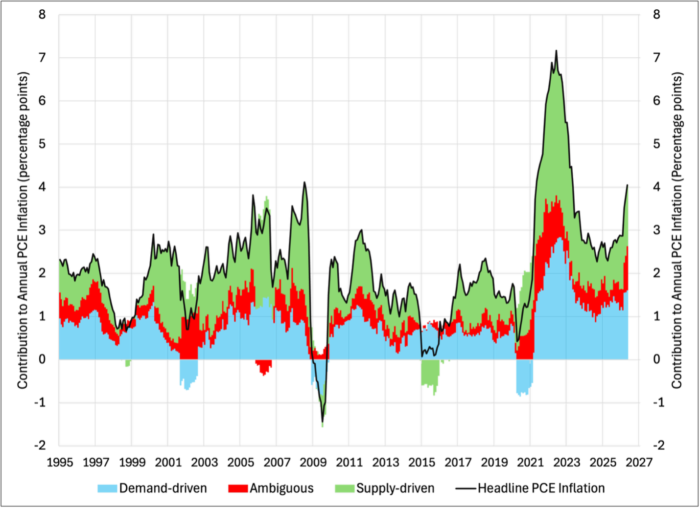
Notes. The bars sum to headline PCE inflation (black line). Sources. Federal Reserve Bank of San Francisco. Method: Adam Shapiro, "How Much Do Supply and Demand Drive Inflation?" FRBSF Economic Letter 2022-15.
Shapiro is candid about the limits of his method. He classifies co-movements. He does not identify the underlying shocks, say anything about the slopes of the demand and supply curves, or separate real from nominal price changes. Still, his approach is a move in the right direction. What limits it is that current data require inferring quantities rather than observing them directly.
The U.S. data architecture infers what it ought to observe
Both things the Fed needs come back to the same requirement: prices and quantities observed together. For the trend, quantities identify a bias that moves; for the shock, they are the whole question. The U.S. data system does not provide it — it observes prices and quantities apart, and infers the link.
The Census Bureau collects data on revenue. The Bureau of Labor Statistics collects data on prices. The Bureau of Economic Analysis then divides the first by the second. Real output is not measured at all: it is an odd residual, built by deflating nominal spending with a price index that a different agency constructs from an entirely separate sample.
Ehrlich and coauthors make the point forcefully: agencies gather prices and quantities independently and combine them only at a high level of aggregation, long after the fact, and subject to extensive revision. Scanner data, by contrast, deliver a price and a quantity from the same transaction at the same moment, and they are not revised. Proper indexes require joint observation, something the current data architecture cannot supply.
Would joint observation settle the key FOMC questions on its own? Ehrlich et al. show it would not. When the authors compare their scanner results with the official CPI, differences widen sharply once they impose a demand model to handle quality change and the churn of products on and off the shelves. One specification yields a substantially lower inflation rate than the CPI; another produces a nonfood index negatively correlated with it. The same prices, run through different theories of consumer behavior, produce opposite conclusions. The judgment calls facing the FOMC do not disappear. Better data just relocate them.
What the new data can do
"Better data" means different things, some helpful, some not. Speed and precision may sharpen a reading, but shrinking today's already-small sampling error would do little to improve the estimate of the inflation trend. Finer coverage and disaggregation are a different matter, as the tariff tracker showed. They reveal the shape of the price distribution — the breadth of price increases and the skew — which shows whether the trimming rule is biased this month (see our recent post). The observables that matter most are the frequency of price changes, which can flag a shift in the price-setting regime, the quantities that identify the shock, and quality proxies that better define the good being priced.
Summing up, new data can best answer what the Fed needs to know by widening what it observes, not by sharpening what it already sees.
Three developments make the case for acting now. The first is that the old ways are atrophying. Survey response rates have slid for years, and last autumn's shutdown didn't just delay some monthly readings — it left them uncollected. Those gaps always come at the worst moment.
The second is that the economy is changing faster than the current architecture can track it. Consider shelter, the largest single component of the consumer price index. The CPI imputes owners' equivalent rent (OER) from a sample of rental units, each repriced twice a year. That is why the CPI's OER measure lags the market by roughly a year: market rents, which private indices such as Zillow's capture in real time, peaked 12 months before CPI shelter inflation did. The BLS built its New Tenant Rent Index to pull that more timely signal directly from its own micro data, but last autumn's shutdown halted the housing survey behind it, so by April 2026 the index was shelved.
The third is that there are questions only new data can answer. Chief among them: what is artificial intelligence doing to productivity and employment? That is the assignment of the Productivity and Jobs Task Force, and the subject of our next post.
What the Data Task Force should do
Three things follow.
Buy the scanner data and build redundancy. This case is the least controversial and the most urgent. A central bank’s statutory mandate does not pause when the government’s statistical agencies shut down for lack of congressional funding. Private information sources operated straight through the shutdown. The Fed should have them in hand before the next one.
Measure prices and quantities together, and record what the goods are. Shapiro’s approach is sound, but his stylized identification runs on data that cannot fully support it: the quantities it needs are inferred, not observed. Item-level transaction data deliver prices and quantities together. Building that capacity is the single most valuable thing the Data Task Force could propose, because it answers the question the FOMC must face at every meeting: what kind of shock is this? In addition to prices and quantities, the record should carry the attributes of the good. Cafarella and coauthors got theirs from nothing but the terse product descriptions in the scanner file.
Publish the analytic methods and negotiate the right to publish key summary statistics. Private data are often proprietary and expensive. If the FOMC comes to rely on numbers few outsiders can inspect, it will have traded one opacity for another and put its own credibility at risk. When the Fed acquires private data, it should publish the methods it applies to them and secure, by contract, the right to release enough underlying information for others to check its work.
The Bottom Line
Chair Warsh is right to want better official statistics. He is also right that the economics profession now has tools that did not exist when the current data architecture took shape decades ago. But sampling prices more often will not by itself tell the FOMC which kind of shock it faces, or whether its estimate of the inflation trend is unusually biased today. For the first purpose it needs quantities, measured rather than inferred. For the second it needs the full distribution of prices, not merely the summary, along with the frequency of firm price-resetting and better data on the changing quality of goods.
The Data Task Force should start there.