
How Should the Fed Measure Inflation?
"I think the data that's being used to judge inflation is quite imperfect data…. What I'm most interested in is, what's the underlying inflation rate?” Federal Reserve Chair Kevin Warsh, Senate Banking Committee confirmation hearing, 22 April 2026.
Chair Warsh is right on both counts. Price measures are imperfect. And the principal question worth asking is what the trend of inflation is, something that we can only estimate from multiple observations. It is the expected path of trend inflation that should guide monetary policy.
Chair Warsh’s new Data Task Force will find that this primary question hides a second one. The FOMC needs a number that lets the public hold it to account. This is a public target that requires a measure with different features.
The good news is that these questions do not conflict. Nothing forces a choice between them. The FOMC can do both jobs well by treating them separately. Asking one number to serve both roles creates trouble.
This post provides an illustrative analysis. The examples below frame the kind of questions the Data Task Force must work through before it settles on any answers. We take the two jobs in reverse order, beginning with the public target, and then turning to the “underlying inflation rate” that Warsh asked about and that should guide policy decisions. (We do not consider data such as monetary aggregates or indicators of inflation expectations that are related to inflation and may therefore be useful for policy setting. Inflation drivers and leading inflation indicators are a subject of our next post.)
External communication and the inflation target
To make policymakers accountable, they need a public target that people — including investors and legislators — understand.
The requirements are straightforward: the inflation measure should be simple, broad, and familiar. It should arrive quickly, be reasonably robust to changing preferences, and be largely impervious to revision. Indeed, nobody can grade the central bank against a number that statisticians alter substantially over an extended period (think of the revisions to real GDP that occur for years after the initial release).
The natural candidate is the headline consumer price index. Former St. Louis Federal Reserve Bank President James Bullard made the case 15 years ago. Gas and grocery prices are the ones people see most often, and a central bank that appears to exclude them from its thinking does not help itself. Whatever its statistical merits, a measure that throws out a large share of consumer spending — including the prices people observe most closely — is not a yardstick that inspires understanding or confidence.
Reflecting the goals of transparency, simplicity, and credibility, nearly every inflation-targeting central bank has settled on the same basic measure. The ECB targets the Harmonised Index of Consumer Prices. The Bank of England targets the CPI, as do the Reserve Banks of Australia and New Zealand. Sweden’s Riksbank targets the CPIF. Canada targets the CPI and treats its core measures as an operational guide to help hit that target. The Fed's choice of the PCE — a broader index the public doesn't encounter directly, and one that gets revised after the fact — makes it the outlier.
How the Fed got there is instructive. In July 1996 the FOMC debated the meaning of price stability. Then-Chair Alan Greenspan asked whether the goal was price stability or zero inflation, and defined price stability as the state in which expected changes in the price level do not alter household and business decisions (see FOMC transcript page 51). Then-Governor Janet Yellen pressed him for a number. His answer: the number is zero, if inflation is properly measured. Her answer: 2 percent, imperfectly measured. The Committee settled on 2 percent. Members knew that the CPI ran roughly half a percentage point above the PCE, yet — as the Richmond Fed records — it never settled the index to which the 2 percent applied.
Four years later, in its February 2000 Monetary Policy Report, the Fed switched the inflation measure it featured from the CPI to the PCE. The formal 2 percent target on headline PCE arrived only in 2012, in the FOMC's first Statement on Longer-Run Goals.
Oddly, different groups of U.S. central bankers selected the target rate of inflation and the targeted index 16 years apart. The two choices do not fit together. Current estimates put the CPI's overstatement of the cost of living at roughly 0.85 percentage points a year and the PCE's at roughly 0.5. As a result, if the FOMC were now to adopt headline CPI inflation as its measure without altering the 2 percent target, it would effectively tighten the policy objective. Put differently, the same 2 percent target means less true inflation when measured by the more upward-biased index.
We do not tell the Data Task Force which price metric and quantitative target to pick — only that they should pick them jointly, explaining the choice.
Internal decision making and the inflation trend
One way of stating the FOMC's goal is that it strives to keep inflation, measured by the change in some broad price index, at some number over the medium term. Both the CPI and the PCE overstate the true rise in the cost of living, for reasons we set out in an earlier primer, but in normal times that bias is slow-moving. It then has little impact on the pace of change over episodes of a few months or a year. When relative prices move sharply, the bias moves with them — a complication we take up in our next post.
The analytic goal is to extract inflation’s trend — say, over a few years — not the month-to-month fluctuations that frequently dominate reporting of the data. In 2008, then-Chair Ben Bernanke described this task. Policymakers, he said, must judge in real time which changes in measured inflation are transitory and which will persist. That distinction has extremely important implications. Policy works with a lag, meaning that the Committee must act on a forecast. Bernanke called for further work on filtering the incoming data to better measure the trend. That was 18 years ago.
Identifying inflation’s trend is a typical signal-extraction problem. Monthly price data mix what is usually a slow-moving trend with high-frequency noise. Occasionally the trend can change abruptly — say, when inflation expectations ratchet up or down. Ideally, policymakers need a timely, accurate indicator of that trend: a measure that moves when, and only when, the trend itself has changed.
For a variety of reasons, it is quite difficult to separate the inflation signal from the noise. An indicator can point the wrong way. It can get the size of the change wrong. It can arrive late. And it can misjudge persistence, treating a lasting shift as temporary or the reverse. Each error can be either systematic, which creates bias, or random, which creates noise. These errors never disappear.
There are two primary ways to filter out noise: averaging across goods within a month and averaging across months. We take them in that order, because the first makes the second easier. Within each category, we also consider filters that exclude different parts of the index, either in a fixed way or in statistically changing ways. To keep the examples concrete, we use the PCE price index, which the FOMC currently targets.
Averaging across goods and services. Consider the range of prices reported in a single month — the cross-section. A few jump and most barely move. Which ones say something useful about the trend?
The conventional answer removes food and energy from the total, but this “core inflation” measure is theoretically flawed. Like any fixed exclusion, it assumes both that certain prices never carry any information about the trend and that other prices always do. Both assumptions are wrong.
The statistically better answer is to trim the tail. Compared to a bell-shaped curve (or “normal distribution”), the distribution of monthly price changes has “fat tails.” A few prices move sharply every month, and those moves usually reflect something specific to one market rather than a change in the overall trend. But they still pull the average around, making them a source of high-frequency noise. Removing them reduces this noise.
Bryan and Cecchetti proposed two alternative filters: the weighted median, which focuses on the price change precisely in the middle of the cross section, and the trimmed mean that discards a fixed share of each tail. In practice, both deliver an estimate of the trend with less noise than the traditional core ex-food-and-energy measure. The Cleveland Fed publishes a median CPI and a trimmed-mean CPI. The Dallas Fed publishes a trimmed-mean PCE.
All of these filtering approaches have one thing in common. They try to answer the same question: what is the underlying trend in inflation — the number the FOMC is trying to keep near target? The choice among them is not a matter of taste. One measure is better than another if it signals a change in the trend sooner and more accurately. The latter means that it does so without bias — that is, without systematically erring in one direction.
Averaging over time. Random noise also averages out over time. For example, one common measure of the trend is the average rate of inflation over a three- or five-year period. Unfortunately, these measures are available far too late for policymakers, who meet every six weeks or so to set an instrument that affects inflation 12 to 18 months later. Conversely, averaging over too few months means that the high-frequency variation dominates any measure of the trend. The point is that there is a tradeoff between precision and timeliness. As the averaging window lengthens, precision rises and timeliness falls.
How long a time window you need depends on how noisy the series is after cross-sectional filtering. As an example, we compare three PCE measures against a simple estimate of the true trend – the three-year centered moving average of headline inflation: raw headline inflation, the conventional core that excludes food and energy, and the Dallas Fed’s trimmed mean. For each, we compute a trailing average over the past 3, 6, 12, or 18 months, and ask how close it typically comes to that estimated trend. Table 1 reports the results (measured as the root-mean-squared gap) for the era of (mostly) stable inflation since 1995. Smaller gaps mean a better fit for the trend.
Table 1. Root-mean-square deviations between a trailing inflation average and a 36-month centered moving average of headline PCE inflation, 1995 — 2024
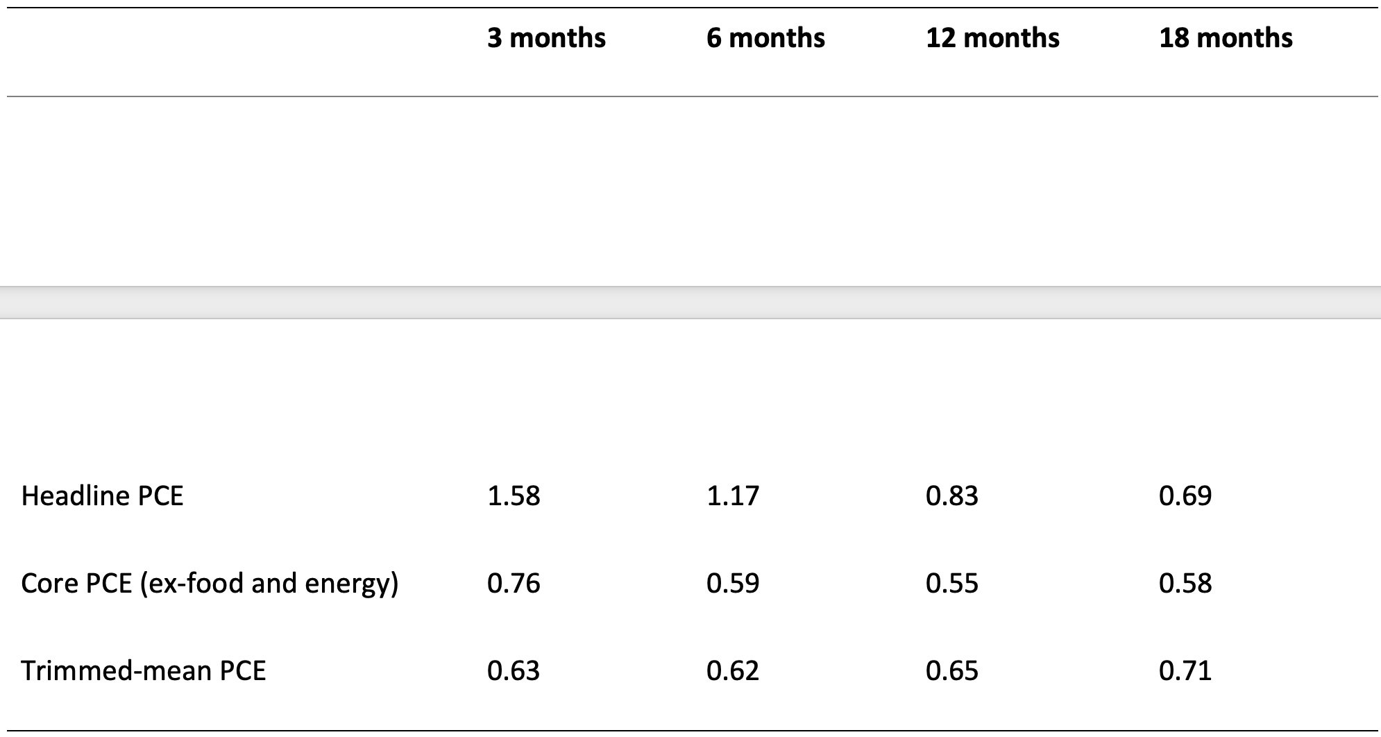
Notes. Each entry is the root-mean-square deviation, in percentage points, between a trailing average of the measure and a 36-month centered moving average of headline PCE inflation — our stand-in for the trend — computed monthly over 1995 — 2024. Smaller is closer. Series: PCEPI, PCEPILFE, and the monthly trimmed-mean PCE (PCETRIM1M158SFRBDAL). Sources. Bureau of Economic Analysis and Federal Reserve Bank of Dallas via FRED.
Headline inflation is hopelessly noisy at short horizons. A three-month average misses the trend by more than 1.5 percentage points. It does eventually track the trend closely, but only with a window of roughly 18 months — by which point the indicator is using nearly the same data as the three-year average it is meant to anticipate. To be sure, headline is the only measure that keeps improving as the window lengthens, but that merely reflects the fact that an 18-month average and a three-year average are built from much of the same data.
The filtered measures do far better, and they do it faster. At six months, core and the trimmed mean are about equally close to the trend. The difference emerges as the window shortens. The conventional core degrades: at three months it misses by 0.76. The trimmed mean error barely changes: at three months it still misses by 0.63. Trimming has already removed most of the noise, so a single quarter of prices is enough. Averaging it over a longer horizon actually makes things worse.
So trimming buys timeliness. But the numbers here are illustrations, not recommendations. The best window depends on the measure, and the measure itself rests on choices we have not examined: the level of disaggregation, the amount trimmed, and the treatment of the two tails. And the last — exactly how to trim — leads us to the issue of bias.
Trimming and skewness. Trimming gives an unbiased estimate only when the distribution of price changes is symmetric. It rarely is. The Cleveland Fed documents that in most months since 1978, the distribution of PCE price changes exhibits negative skew. That is, the long tail is on the side of price declines. Goods prices explain why. For decades they rose more slowly than services prices, and many fell outright.
Skew drives a wedge between the mean and the median. When a distribution is negatively skewed, the mean is below the median. In this case, the median reads high relative to headline inflation, and so does any symmetrically trimmed mean. The more you trim, the bigger the bias. This is an important caveat on the statistical estimators: they are unbiased only when the distribution is symmetric, which it almost never is.
The Dallas Fed's practice of “asymmetric trimming” aims to address this bias. It removes 31 percent of the weight from the upper tail and only 24 percent from the lower tail. Cutting more from the top pulls the estimate down. That offsets the upward bias created by the left skew, and over long periods it delivered an unbiased reading of headline inflation.
The pandemic changed that pattern. Goods prices surged and the skew turned positive. The mean now sat above the median, so a symmetric trim read low and an asymmetric trim (like the Dallas trimmed mean) read lower still, because the built-in asymmetry was pushing in the wrong direction. The Cleveland Fed estimates that by the end of 2021, median PCE understated the trend by about 15 basis points and the trimmed-mean PCE by about 35.
The choice of index matters here, and not in the way one might expect. The Cleveland Fed's companion analysis for the median and trimmed mean CPI finds a much larger bias over the same pandemic period — 95 to 115 basis points — than for the PCE. Despite the favorable features of the CPI as a public benchmark, CPI measures are more biased than their PCE counterparts, not less.
Regardless of the index, the bias in the statistical measures is worst at exactly the wrong time. In calm episodes, the skew is small, so the bias is small, too. But a broad-based surge in prices thickens the right tail. The event that increases the trend is the same event that biases the statistical measure downward. Put differently, the trimmed mean is most reliable when the trend is stable and least reliable when it moves. In 2021, prices rose across a widening set of categories. The trimmed mean stayed low while the trend rose, and the FOMC waited too long to respond.
The current readings make this point concrete. Over the 12 months through May 2026, trimmed-mean PCE rose by 2.4 percent, PCE excluding food and energy 3.4 percent, and headline PCE 4.1 percent. The trimmed mean sits a full percentage point below core. That is unusual. Historically it runs above. In the following chart, headline PCE (black) and core PCE (red) sit close to the trimmed mean (blue, dashed) in calm periods, then fan apart at the turning points that matter most for policy setting.
Headline, ex-food-and-energy, and trimmed mean PCE prices (Percent change from year-ago levels, monthly) 2015 — May 2026
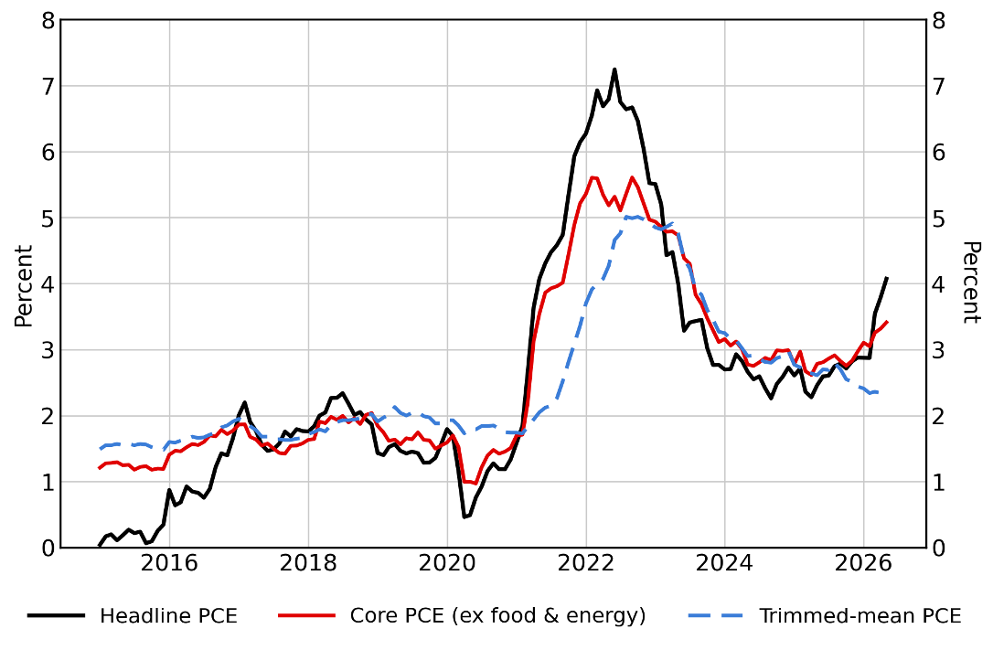
Notes. Headline (PCEPI) and excluding food and energy (PCEPILFE) PCE prices from the Bureau of Economic Analysis; trimmed-mean (PCETRIM12M159SFRBDAL) PCE prices from the Federal Reserve Bank of Dallas. Sources. FRED.
The deeper lesson concerns calibration. The Dallas Fed fit its trimming rule to the distribution from 1977 to 2009, an era of falling goods prices. That made sense at the time. But the 2025 tariffs reversed the goods-price pattern that motivated this asymmetric trim. Goods prices are rising broadly again, and the Dallas Fed now warns that rising skewness calls for caution in reading its own measure. A rule calibrated to any past distribution can produce a misleading measure of the trend when fundamentals alter it.
From an analytic perspective, summary statistics like the median and trimmed mean are useful, but they cannot substitute for looking at the evolving distribution itself. When price increases become widespread and the skew turns positive, both can understate the trend. Policymakers need to recognize and explain when that happens. While their analysis may be internal, there is no reason why it should not be made fully public. None of these data is proprietary.
What the Data Task Force should do
Warsh is right that the official statistics can be improved, and the Data Task Force should improve them. At his June 2026 press conference, he said the current numbers "look very little like the U.S. economy." Fair enough. But better data is not enough to hold the Committee accountable. Nor will it alone give policymakers the information they need. The FOMC must separate the two jobs – something that better data cannot do.
From this, four things follow.
Explain which number does which job. The FOMC reads trimmed means, medians, and short-term averages internally. It reports headline inflation externally. It has never explained the relationship between them. The Bank of Canada has. It calls its core measures an operational guide to help achieve the total CPI target, and says plainly that they are not a replacement for it. Explaining the division is straightforward and helps the public understand policy and hold the central bank accountable.
Choose the external measure and its target number together. Pick an index the public recognizes. Set the number consistent with that index and its average measurement bias. Then track that bias as a standing check on the target.
Routinely publish the internal analytic methods. Disaggregation, trimming, and the asymmetry between the tails are judgment calls, and each one can affect policy decisions. None of them appears in any FOMC statement. Publish them frequently. Publish the skew and the breadth of price increases alongside the filtered number. Anyone should be able to see when and understand why the filter stops working.
Keep checking that the filtering methods still work for estimating inflation’s trend. Every rule for separating the trend from the noise reflects a particular distribution of price changes. The Dallas Fed built its trimmed mean PCE using data from an era of falling goods prices. Tariffs and other supply shocks have reversed that pattern. The distribution will almost surely continue shifting, and filtering rules must keep up.
Transparency serves both jobs at once — both external communication and internal decision making. We recently made the case for disclosing more of what matters and less of what does not, against the current plan to communicate less. The same arguments extend to the analysis of inflation data. Bernanke described inflation targeting as a matter of constrained discretion. The constraint comes from telling the public two things: what the central bank aims at, and how it will know when it gets there. Data transparency is part of that constraint.
The future of price data. In our next post we turn to the new price data — high-frequency prices and scanner records. The latter deliver actual prices paid and quantities purchased, reported within days or weeks rather than a month or more. The gain, however, is not the one you would expect. Measuring prices more precisely does almost nothing for the estimate of the trend. The value lies in what these data let the Fed observe that it cannot observe now: how often firms change prices, the quantities that identify the shock, and numerous attributes of the good or service. Even then, one thing will escape them: a regime shift driven by inflation expectations. For that, we already have high-frequency market-based measures.